Flows, wireframes, and a clickable prototype your staff can try. Changing a prototype takes an hour. Changing a finished build takes a week and an invoice.
Someone writes a feature list, a developer starts building, and nobody checks whether the screens make sense together. The result works and still nobody uses it.
Staff avoid the new system and keep the spreadsheet
Every feature is two clicks deeper than it should be
The mobile version was an afterthought
Nobody agrees what the main screen is for
What you get
What a UI/UX engagement covers
We size this to the product. A five-screen app is not a portal.
01
Job mapping
We write down the two or three things people must be able to do, then rank everything else below them.
02
User flows
Step-by-step paths for each job, including the empty, error, and waiting states developers usually get handed late.
03
Wireframes
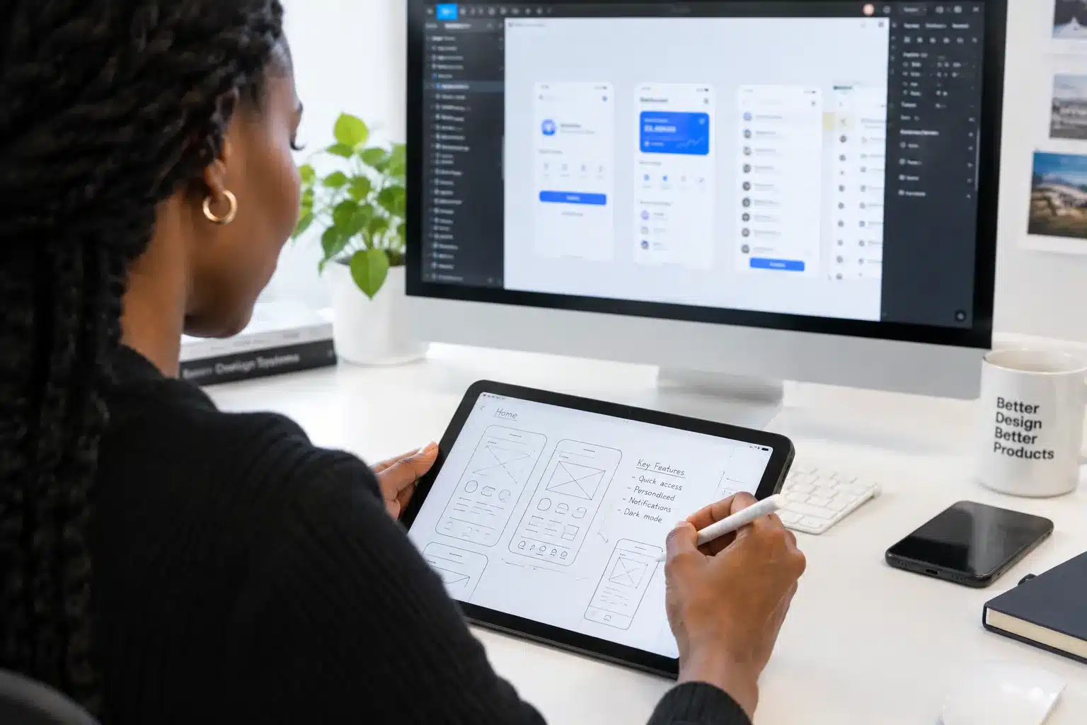
Grey-box screens to argue about structure before anyone discusses colour.
04
Full screen design
Real type, colour, spacing, and content, designed at mobile and desktop widths.
05
Clickable prototype
A link you can send to staff or a board. They tap through it and tell you what is confusing.
06
Component handoff
A component set with spacing and states, which our developers build from directly.
Typical timeline
Three to five weeks for a product of real size
A single flow or a landing page is about one week.
Step 01
3 to 5 days
Interviews
We talk to the people who will use it daily, not only the person paying for it.
Step 02
1 to 2 weeks
Flows and wireframes
Structure agreed in grey boxes, reviewed in a working session, not by email.
Step 03
1 to 2 weeks
Screen design
Full visual design with real content, at both widths, in a shared file you can comment on.
Step 04
3 to 5 days
Prototype and test
Clickable link, five short sessions with real users, then a list of fixes ranked by damage.
This service, in the wild
Products we designed before we built them
Open a project to read the full story.
UI/UX Design
Academic platform, nursing and midwifery colleges
Scholarium
Student, lecturer, and admin dashboards mapped with registrars and bursars first, then designed and tested before development started.
Yes. The handoff includes flows, screens at both widths, a component set, and a walkthrough recording for your developers. We are happy to answer their questions during the build even if we are not writing the code.
Where we can. Five people from your actual audience finds most of the problems. When that is not possible we test with your staff, which is still better than testing with nobody.
We review them against the jobs the product has to do and tell you honestly whether the issue is the design, the scope, or the build. Sometimes the answer is that the designs are fine.
Yes, as part of the work rather than an audit at the end. Contrast, focus order, target sizes, and labels get checked while we design, not after launch.